
It is 12:50pm on a Sunday, and the LDP has stopped moving. The sky is the same grey as the road, no thanks to the haze.
Just before the Bandar Utama exit, a green screen cuts through the murk. Say what you like about digital billboards, but at least they bring their own light. A dish of curry. A carton of coconut cream. Two words: "Cukup Lemak."
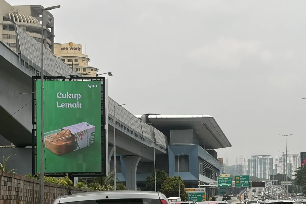
From a distance, I'd have sworn it was GrabFood. That shade of green belongs to Grab in most Malaysian minds. But the traffic gives me time, and the picture does the rest. The dish, the pack, the logo. No words needed. No lag in decoding.
I don't cook at home. My wife does. Yet by the time the car crawls past, I've already decided to tell her about it.
This is Kara's coconut cream campaign, running on digital screens nationwide. Kara's own line is "Ingat Santan, Ingat Kara", which means remember santan, remember Kara. It's the kind of outdoor work people photograph and talk about. And when people talk about a billboard, they almost always talk about the creative, as we did with the Mr DIY billboard handle.
At Pi Interactive, we ask a different question.
Not "is it beautiful?" But who is actually sitting in this traffic? Where did they come from? Where are they going next? And when?
One screen, one month
I picked one digital billboard from the campaign: the one I pass most often, on the northbound LDP, about 150 metres before Exit 1103 to Bandar Utama and TTDI.
Then we followed the traffic past it, using MOBI, Pi's mobility analysis. A month of anonymised GPS trips, 1 to 30 July, around the clock. About 285,000 journeys passed under that screen.
Yes, July. Kara's campaign wasn't even up yet. Think of it as a background check: before you judge a billboard, you check the road's record. It's the same idea as setting a baseline before any campaign. And the LDP is a creature of habit: across July, congestion barely moved from one week to the next. We're betting October looks much the same. We'll check.
Not a survey. Not a clicker count on one Tuesday morning. Every one of those journeys, traced back to where it joined the highway and forward to where it left.
Here is what the road told us.
Where does the traffic come from? Ten sources, one screen
Ask anyone where a highway's traffic comes from, and you'll hear the same answer: everywhere. A screen on the LDP looks out on a river of cars, and nobody can tell you where the river starts.
We can. We sorted every one of those trips into ten sources of traffic. So where is "everywhere"? Which source carries the biggest group?
Where the trips joined the LDP
Share of all trips, by source.
Each trip is counted once, in one group, so the shares add up to 100% after rounding. They count trips, not people: a regular commuter can appear many times. Trip start points are blurred for privacy, so read these as corridors, not individual streets.
Why it matters: a traffic count tells you how many cars pass. It can't tell you where they came from, and where they came from is the first clue to who they are. Once you know the point of origin, you can ask three better questions. Where to place my next digital screen? Is my next screen reaching new neighbourhoods, or the same ones again? Does my campaign cover the corridors my customers actually use?
Where do drivers go next? Then the road splits
Now the part I find most useful.
Just past the screen, the crowd divides, and it divides cleanly.
56% turn off at Persiaran Surian. That's the turn-off just after One Utama, towards Kota Damansara and Damansara Perdana. The other 44% carry straight on. The biggest group of them, 19% of all trips, leaves for the Middle Ring Road 2 (MRR2) a little further up.
Exhibit 2 · Where it goes next MOBI
56% of trips turn off at Persiaran Surian.
44% carry straight on. Where they leave next:
Share of all trips that pass the screen, July 2026, northbound LDP. Source: Pi Interactive MOBI analysis of licensed traffic data. Shares may not add to 100.0% because of rounding.
Why it matters: many outdoor plans stop at the screen. They shouldn't. A billboard starts the thought, but the exit decides where it ends, and here more than half of the drivers leave at one exit just past the screen. Plan the route, not the screen. I'd put the next dollar at that exit, not into a bigger version of the same screen: a sampling roadshow at the right mall, an offer, or a second screen for the drivers who have already seen the first. Reach is bought on the road. Conversion is won after it.
How long do drivers see the screen? Why the jam is the product
Drivers hate traffic. Billboards love it. Here's why.
Every weekday in July, without exception, the roads around the site crossed 50% congestion at 7am and again at 6pm.
On an average weekday, congestion stays above 50% for about six hours: three in the morning, three in the evening.
The worst hour of the month? Wednesday 29 July, 6pm. Average speed across the area: 23 km/h. Enough time to read the billboard twice and question every life choice that put you on the LDP at 6pm.
By our estimate, a driver on a clear road is past the screen in about 16 seconds. In the jam, it's closer to 34, about twice as long to take in the ad.
How long does a driver spend in front of the screen?
Two cars cover the same 250 m before the screen: one on a clear road, one at 6pm on a Wednesday. Shown at 4x speed.
Estimate: area-wide average speed over an assumed 250 m stretch where the screen is visible. On a clear road, about 56 km/h and 16 seconds. The time-lapse runs at 4x speed.
Most outdoor creative is built for the split-second glance: a bold picture and almost no words. That's the right call on a clear road. But on this stretch of the LDP at 6pm, the window is closer to 34 seconds. A good creative survives the glance. The jam gives it time to be read.
Screens like this usually rotate several advertisers, so more time in view also means a better chance of catching your slot. The jam throws that in free.
It's also how my GrabFood moment got fixed. At speed, I misread the screen. In the jam, it had time to correct me.
And if you commute this way every weekday, you pass it about 20 times a month.
Why it matters: time in view isn't a constant. At 6pm the window is about twice as long as on a clear road. Design for the glance, but on a slow road a screen can afford one more idea.
When is the LDP busiest? Saturday changes the traffic
The data held one more surprise.
Weekday lunch here is lighter. Saturday lunch is not. At 1pm, Saturdays hit 73% congestion, almost weekday rush hour. Even Sunday, the calmest day of the week, peaks in the early afternoon.
Here is the whole week, hour by hour.
Weekday commuters. Then Saturday happens.
Average congestion by hour for each day, across about 300 km of roads around the site.
Swipe the grid sideways to see every hour.
My Sunday photo sits right in that pattern. The data can't tell me who was in the car beside me at 12:50pm. But on a weekend lunchtime, next to 1 Utama, my guess is it wasn't a commute.
So the same screen faces two different traffic patterns:
- Weekdays: two sharp rush hours, on the same routes, every day.
- Weekends: a long midday build-up, with Saturday the busiest.
The creative works in both. Whether the drivers in each are ready to do the same thing next is a different question.
Why it matters: buy the clock, not only the site. This screen has two busy rhythms: a sharp weekday rush hour, and a long Saturday afternoon when congestion stays above 50% for eight hours straight. A schedule built around the commute misses the second one, and a digital screen can run a different message in each.
Don't only read the billboard, read the road.
The next time you plan your outdoor campaign, don't only ask how many cars pass by the screen. Also ask where the cars are coming from and where they are heading next. By asking a different question, you reveal other truths, and those insights can become strategic decisions that make your campaign even more impactful.
I run an outdoor media company in Malaysia. My best thinking happens at KM4.8 of the LDP, going nowhere fast. That's Heads-Up.

Alex Goh, Founder, Pi Interactive, an independent outdoor media agency in Malaysia. Views are personal.
The numbers behind the exhibits
| Where trips joined the LDP | Share of all trips |
|---|---|
| Exit 1106 Damansara Utama (Bandar Utama, NKVE) | 24.3% |
| Exit 1107 SS2 (Petaling Jaya town roads) | 17.7% |
| Puchong and beyond (Exit 1114 and further) | 13.7% |
| Exit 1108 Taman Megah (SS4 side) | 10.1% |
| Exit 1110 Jalan Majlis (Federal Highway) | 6.8% |
| Kelana Jaya side | 5.4% |
| Jalan SS 21/35 (Damansara Utama) | 4.8% |
| Bandar Sunway side | 4.1% |
| Jalan SS 22/48 (Damansara Jaya) | 3.3% |
| Exit 1111 (Sungai Way side) | 2.7% |
| All other roads, each under 3% | 7.1% |
| Where trips left the LDP | Share of all trips |
|---|---|
| Persiaran Surian, first ramp | 29.4% |
| Persiaran Surian, second ramp | 26.3% |
| Jalan Lingkaran Tengah 2 (MRR2) | 19.1% |
| Towards Kepong | 6.6% |
| Jalan Kuala Selangor | 6.5% |
| Persiaran Ara / Persiaran Perdana | 5.2% |
| Other roads | 7.0% |
About the data
This is Pi Interactive's own analysis, using anonymised data and public road maps. It was not commissioned by Kara or the media owner, and we have no access to their campaign results. MOBI is Pi Interactive's mobility analysis. It uses anonymised connected-vehicle GPS data from a licensed third-party provider. We analysed about 285,000 trips that passed the screen's location on the northbound LDP from 1 to 30 July 2026, before the campaign ran. They are a sample of trips, not every vehicle, and trip start and end points are blurred for privacy, so read the shares by road corridor, not by individual street. Congestion and speed cover about 300 km of roads around the site, and time in view is an estimate over an assumed 250 m stretch. This covers one site, not the whole campaign. Road names are from OpenStreetMap contributors. The data comes from a licensed third-party source; the analysis, interpretation and opinions are my own.